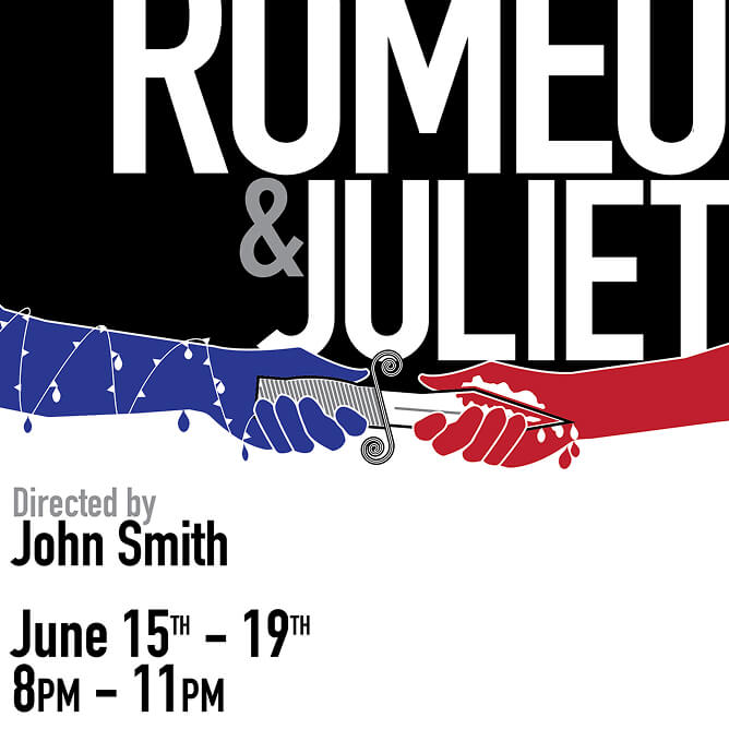
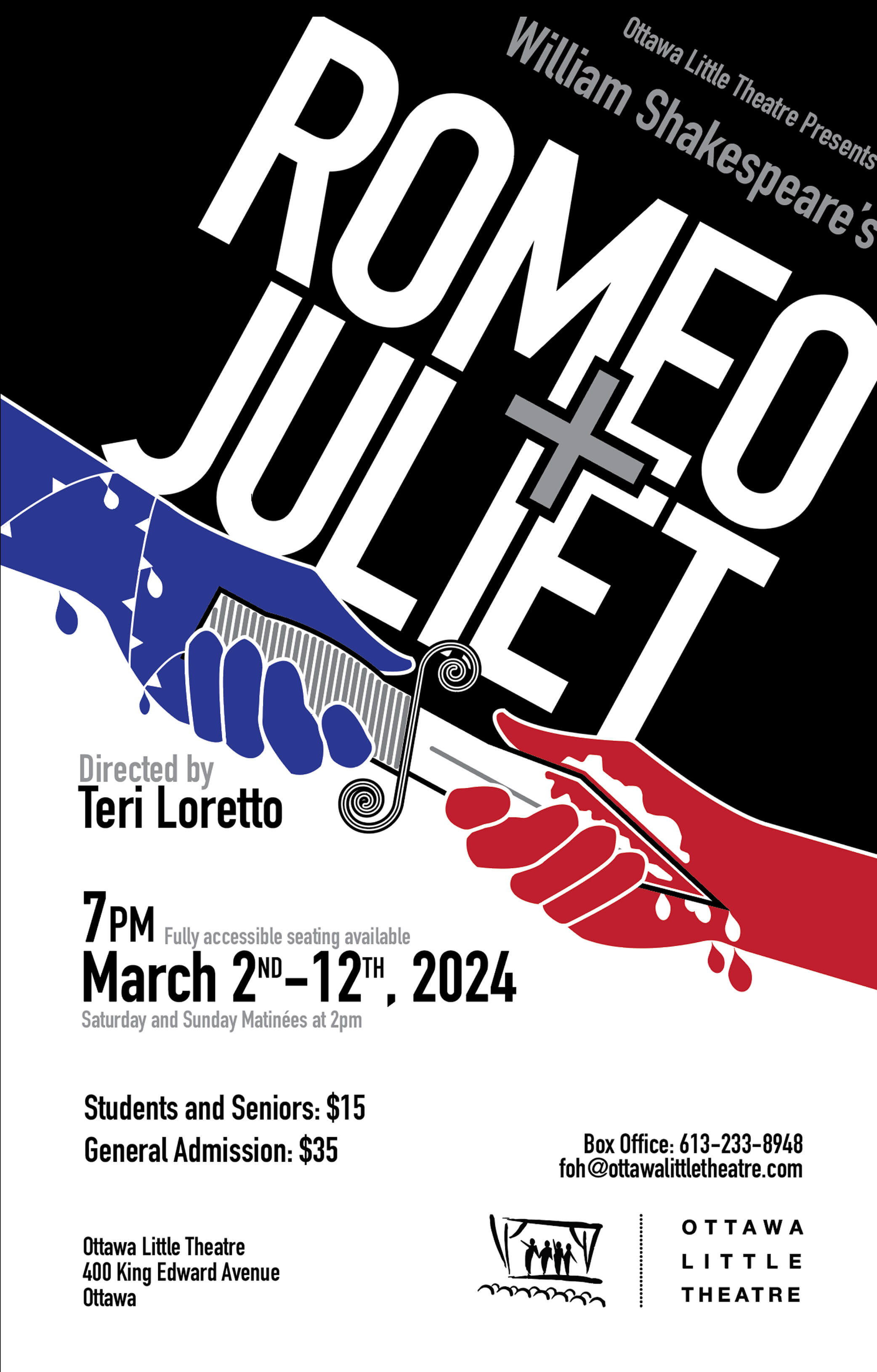
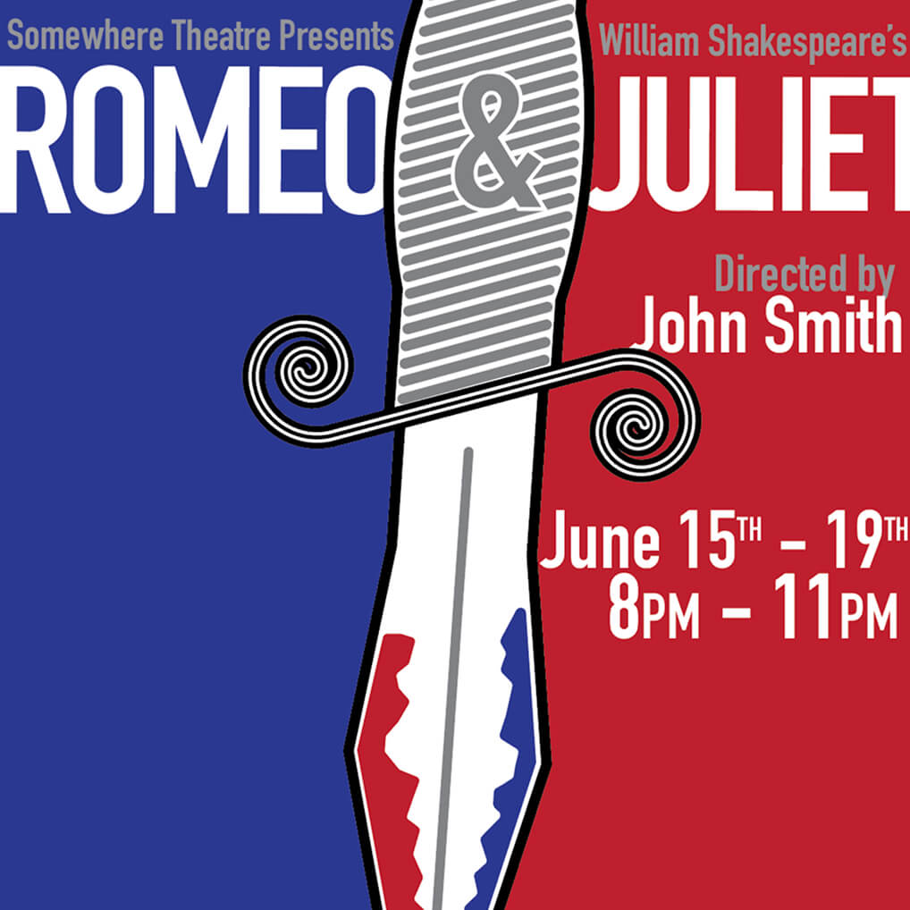
This was a school project that was aimed at creating a interesting yet readable poster for a play at the Ottawa Little Theatre. Created in Illustrator with clean, vectorized shapes, this branding oriented piece focused around the poster itself, but also included subsequent content such as a brochure and a program for the play.
The main focus of the project was obviously to create a good looking and visually appealing poster, but one part that was equally important and something I found a bit more difficult was the text hierarchy. Text hierarchy is an obviously very important part of any poster and with a poster that had as much text as this one did, it was a bit of a struggle to fit it all in the composition in a readable and clean way.
Having experience around the theatre, I had a lot of ideas on how I could make a poster that captivates the eye. I did look at a few other theatre and movie posters. I wanted to focus on the “duality” theme prominent in Romeo and Juliet so I knew I wanted an easily divisible poster that has a very modern look to it. I went through multiple iterations of the knife position and some of the details but I always knew I wanted that sort of violent imagery. One thing I did change very often was the text. Lots of moving the text around and figuring out what worked best visibility and readability-wise.
I am overall very happy with the final design and the work I did to get there. In the end I made the text very big and on a slight angle, as apposed to the heavier angle I initially thought of, in order to keep it easy to read. When I figured out I could imbed the “+” within the logo, I wanted to do everything I could to make it work. I feel it adds a lot in terms of intriguing the user and making them more interested in the play itself.

I have received lots of varying feedback regarding different text placements and certain general design options. I would say that the whole poster could be more unified by making all of the text on the same angle, but I would rather focus on the accessibility of the important information. Overall this project showed my the strength of tracing objects as references and then turning into easily manipulatable vectorized objects.